Ann’s daughter Cecile Richards pwns head of Congressional witch-hunt over use of graph from anti-woman organization September 29, 2015 OzoneTom 374815 Commentshttp%3A%2F%2Fwonkville.net%2F2015%2F09%2F29%2Fanns-daughter-cecile-richards-pwns-head-of-congressional-witch-hunt-over-use-of-graph-from-anti-woman-organization%2FAnn%27s+daughter+Cecile+Richards+pwns+head+of+Congressional+witch-hunt+over+use+of+graph+from+anti-woman+organization2015-09-29+18%3A29%3A49Anonymous+Wonkerhttp%3A%2F%2Fwonkville.net%2F2015%2F09%2F29%2Fanns-daughter-cecile-richards-pwns-head-of-congressional-witch-hunt-over-use-of-graph-from-anti-woman-organization%2F +50
<img src="http://4.bp.blogspot.com/_A2J-AA6uyY8/S8hAT3kSXkI/AAAAAAAAFvU/ig9T8p9mWsM/s1600/funny-graphs-whale-sharks.jpg" /> Reply
The abuse of Venn diagrams on Twitter to try and make points annoys me a lot. This is just beautiful. Reply
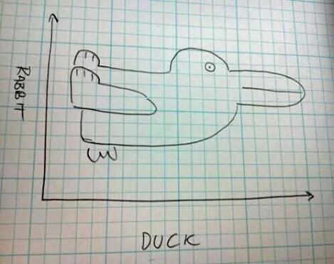
<img src="http://1m5rjm4bgenp2600za110opvl3h.wpengine.netdna-cdn.com/files/2014/10/duck_curve_duck.png" width="388" height="267" /> Reply
<img src="http://2.bp.blogspot.com/_sY9FRN6Xib4/S-GNbkSQ-vI/AAAAAAAAdaU/HWkGe2Y9HFo/s1600/funny_graphs_and_charts_30.jpg" /> Reply
<img src="https://delamata.files.wordpress.com/2010/02/mr-t.jpg" width=300 /> This isn't a graph but was the first thing that showed up when searching… Reply
I pity the fool who don't cook with a FlavorWave. (If you google "silly graph" you'll hit paydirt.) Reply
<img src="http://i0.kym-cdn.com/photos/images/original/000/018/029/image002.jpg?1318992465"> (Thanks!)
<img src="http://3.bp.blogspot.com/-ZtJswk9gqX4/Ulq0lrJu8XI/AAAAAAAAGm4/Iptsrr2wf3Y/s1600/692+Graph+1+Beatles.jpg" />
Alrighty then, it would be patently unfair for me to withhold this: <img src="http://ozoneranch.com/ftp/accurate-pie-chart.jpg" alt-text="Hey alt-text works!"> It was lunchtime and I was hungry And a favorite, if poor-quality, Venn diagram: <img src="http://ozoneranch.com/ftp/JesusVenn.jpg" height="320" width="320/"> Reply
Hallmark should get into this for folks who Venn to snark the very best. <img src="https://s-media-cache-ak0.pinimg.com/736x/c7/3d/d1/c73dd147a2b03745e6e124d545008c98.jpg" width="425"> Reply
<img src="https://s-media-cache-ak0.pinimg.com/736x/42/93/29/42932903b1d1b0a327607c5a03d1918f.jpg"/> Reply
Right — if they had included a Y-axis scale, the chart would have had a line with a pronounced decline at the top, and a second pretty-flat line near the bottom. Reply

<img src="http://4.bp.blogspot.com/_A2J-AA6uyY8/S8hAT3kSXkI/AAAAAAAAFvU/ig9T8p9mWsM/s1600/funny-graphs-whale-sharks.jpg" />
The abuse of Venn diagrams on Twitter to try and make points annoys me a lot. This is just beautiful.
Wittgenstein LIBELZ!!!!!!!!!
<img src="http://1m5rjm4bgenp2600za110opvl3h.wpengine.netdna-cdn.com/files/2014/10/duck_curve_duck.png" width="388" height="267" />
<img src="http://2.bp.blogspot.com/_sY9FRN6Xib4/S-GNbkSQ-vI/AAAAAAAAdaU/HWkGe2Y9HFo/s1600/funny_graphs_and_charts_30.jpg" />
<img src="https://topclasskennedy.files.wordpress.com/2014/01/mr-t-pie-chart.png" />
<img src="https://delamata.files.wordpress.com/2010/02/mr-t.jpg" width=300 />
This isn't a graph but was the first thing that showed up when searching…
I pity the fool who don't cook with a FlavorWave.
(If you google "silly graph" you'll hit paydirt.)
<img src="http://i0.kym-cdn.com/photos/images/original/000/018/029/image002.jpg?1318992465">
(Thanks!)
<img src="http://3.bp.blogspot.com/-ZtJswk9gqX4/Ulq0lrJu8XI/AAAAAAAAGm4/Iptsrr2wf3Y/s1600/692+Graph+1+Beatles.jpg" />
Alrighty then, it would be patently unfair for me to withhold this:
<img src="http://ozoneranch.com/ftp/accurate-pie-chart.jpg" alt-text="Hey alt-text works!">
It was lunchtime and I was hungry
And a favorite, if poor-quality, Venn diagram:
<img src="http://ozoneranch.com/ftp/JesusVenn.jpg" height="320" width="320/">
Hallmark should get into this for folks who Venn to snark the very best.
<img src="https://s-media-cache-ak0.pinimg.com/736x/c7/3d/d1/c73dd147a2b03745e6e124d545008c98.jpg" width="425">
<img src="https://s-media-cache-ak0.pinimg.com/736x/42/93/29/42932903b1d1b0a327607c5a03d1918f.jpg"/>
Right — if they had included a Y-axis scale, the chart would have had a line with a pronounced decline at the top, and a second pretty-flat line near the bottom.
http://vignette1.wikia.nocookie.net/smashbroslawl…
yr welcome!